The 1940s Fixer Upper: Creating the Design Plan
A couple weeks ago, I shared the importance of having a design plan before any renovation takes place in your home. Steve and I practice what we preach, so while we are still in the demo and permitting phase of this 1940s Fixer Upper we purchased from the original owners, I am already preparing the design concepts for the house.
Since we are renovating this home for resale, ideally to a lovely young family, the strategy behind the design is different than it would be if we were renovating it for ourselves or for a client. That said, I still want to WOW people who see the final result… and I know that can be done with some thought and planning.
Today, I’m going to take you through all of these considerations, including the design direction we’ve selected. If you’re renovating a rental or flipping a home, these are all details you’ll want to consider as well. Come take a peek...
We can’t wait to transform this historic, 70-year-old home into a beautiful and family-friendly dwelling.
Step 1: Understanding the buyers & market
When we create a design plan for a home that will go on the market, we have to strategize beyond pure aesthetics. It’s about the goals for the project, how the spaces will be used, and then the style.
In other words, my personal style matters far less than creating a home that is appealing, durable (so it’s family-friendly), and that stays in budget. We have to be smart with our investment.
This home is also a bit different from other projects that we've done. This house should sell for about $200K when finished. In the past, we have worked on homes with values double or more than that. I’ve also researched the surrounding area's recent sales and builds to see what the market expectations are for this price point.
Steve and I have an agreement that we will rein each other in as we progress. Do we need a tankless water heater? No. Should we put stone or quartz throughout the house? Probably not. You see where I am going…
We always want to meet or exceed expectations, but we never want to waste money where it won’t offer a return on investment. Designing a home is all about balance!
Step 2: Selecting the design elements
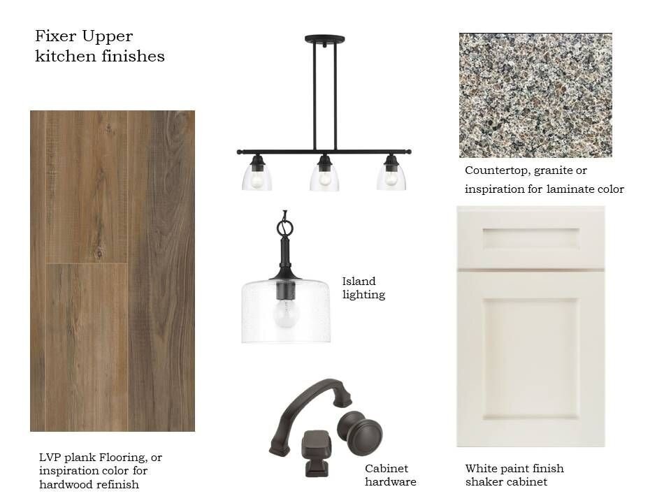
The design boards I’m about to show you include the same key materials in all areas: flooring, cabinets, and countertops. This is economical, and creates flow in a small house. I changed up the hardware and lighting to give variety. A good neutral palette provides a lot of flexibility.
Kitchen Finishes
The house was so dark and dreary when we bought it, but with 8ft. tall ceilings, there’s a lot of room to open up the space and make it feel light and bright. Gray has run its course and is a bit dated, so we’ll paint the wall and trim in a creamy white linen color.
The other benefit of using timeless neutrals, like white or cream, is that they will appeal to a wide variety of people and allow for further style customization when a new family moves their possessions into the home.
To keep things simple and consistent, both the kitchen and master bathroom cabinets will be white, have Shaker-style doors, and will create a beautiful contrast with the darker countertop material. Speaking of the master bathroom…
Bathroom Finishes
While we have uncovered hardwoods in key areas of the house, we have not decided if we will refinish them. They have seen better days. For now, I will plan on LVP (Luxury Vinyl Plank), and we will use it everywhere.
LVP is waterproof and great in bathrooms. This is practical for the homeowner, and is less expensive for us in terms of materials and installation. While tile is not necessarily expensive, beware… the prep and installation is.
Light Fixtures
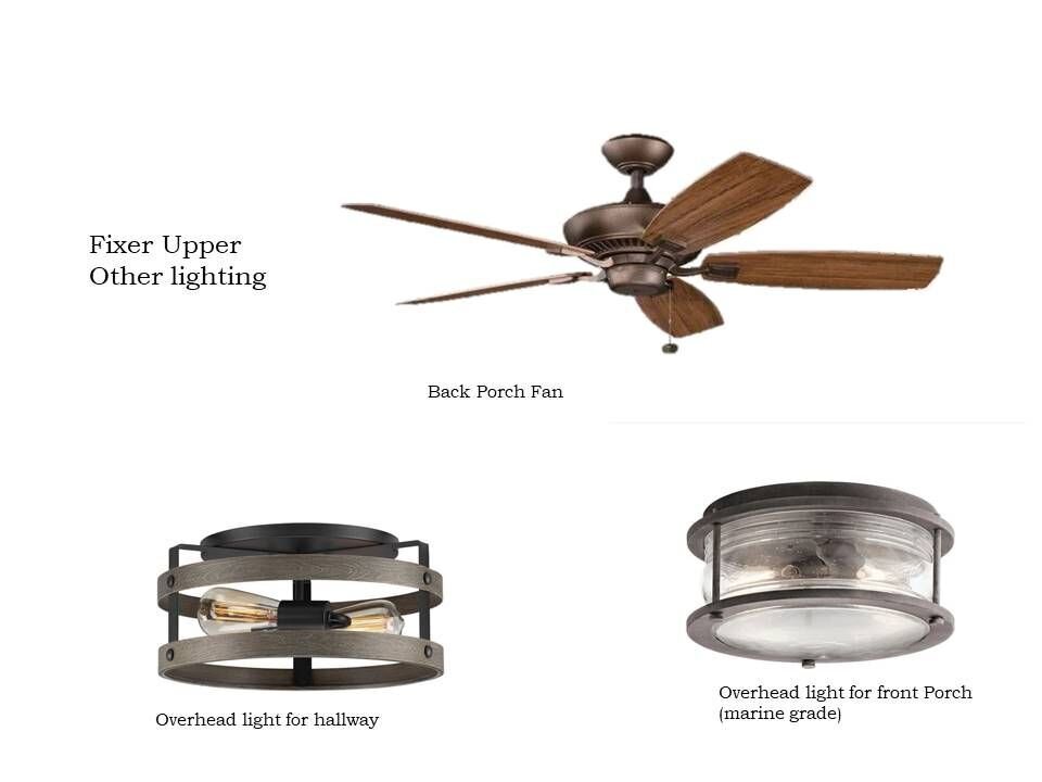
This is Florida, so there will be ceiling fans in key areas. I have made peace with the appearance of a fan versus a decorative light fixture (it’s necessary) and have located a few fans that do not overpower the room while doing the functional job.
Since the hallway and front porch have lower ceilings, a flush mount is the best way to light the space without taking up too much room, making the space feel small, or blocking sightlines. They are subtle, stylish, and functional.
Well, that’s it for now. This fixer upper is going to take a lot of work, and not all of it is going to be pretty (keep an eye out for my post on what Demo Day really looks like), but we are already loving the journey of giving this old, historic, and meaningful home a new lease on life.
I’ll be back again soon with more updates. Until then, be sure to grab our Guide to Preparing for a Kitchen Renovation below.
Warmly,
Sarah (& Steve) Abbott


